When Japan Adopted the Western Alphabet
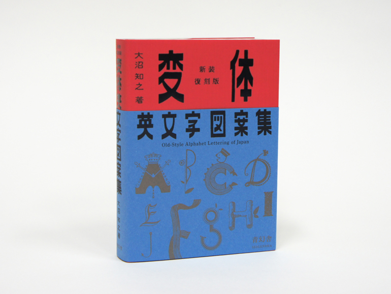
The book ‘Old-Style Alphabet Lettering of Japan’ compiles the typographies taken from English and used in advertising in the 1960s.
© Seigensha Art Publishing Inc.
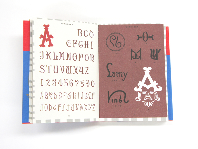
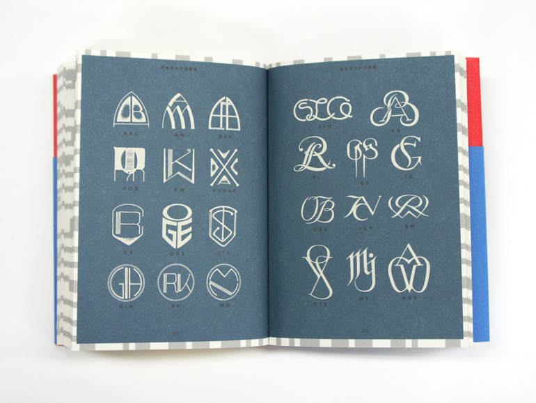
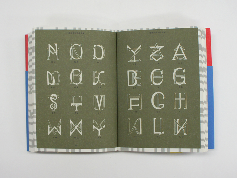
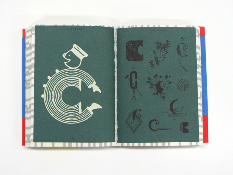
First published in 1962, this collection by Tomoyuki Onuma, reissued in 2018, is a relic from the past. Old-Style Alphabet Lettering of Japan contains seventy fonts, but also over one thousand monograms combining numbers and letters. These signs of various forms testify to the phenomenon of the anglicisation of Japanese culture.
After the Second World War and the American occupation that lasted until 1952, Japan got back on its feet and society developed at full speed. Signs, printed materials, placards… In the 1960s, the typography of the Latin alphabet, primarily in English, became an integral part of everyday life for the Japanese, influenced by western culture.
Characters with a dual function
In paperback format, Old-Style Alphabet Lettering of Japan is organised in such a way as to highlight a letter or a number and then to present its multiple existing variants. Omnipresent in Japanese streets, these symbols strike a balance between aesthetics and functionality. They perfectly fulfil their objective: to inform.
With their clearly defined form, the characters make reading quicker and more fluid. By adopting a foreign language, Japan presented itself as a country that is open to the world. In addition, thanks to its various adornments, the typography used is pleasing to the eye. Full of meaning, it instils a sense of personality and transmits strong values or messages.
Old-Style Alphabet Lettering of Japan (2018), a book by Tomoyuki Onuma published by Seigensha.
© Seigensha Art Publishing Inc.
© Seigensha Art Publishing Inc.
© Seigensha Art Publishing Inc.
© Seigensha Art Publishing Inc.